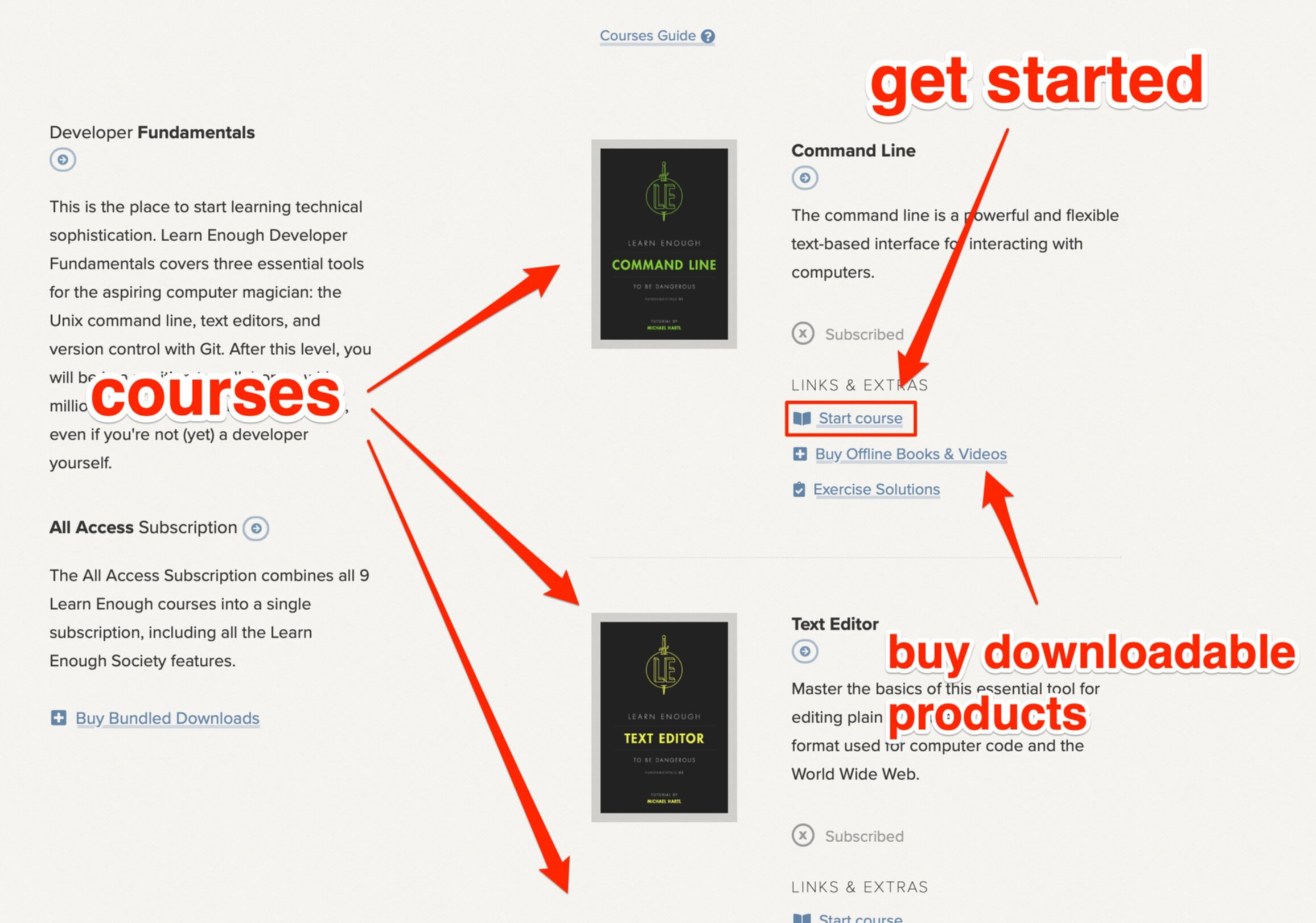
Chapter 5 Laying it all out
Now that we’ve got a good base of CSS knowledge, it’s time to learn how to put everything together into a real website. This chapter and the next is where we really kick things into high gear, with material you’re unlikely to see in any other CSS tutorial. To get started, our first step will be to transform our previous work into a more manageable set of templates and page layouts that can be easily reused and updated (in accordance with the DRY principle (Box 1.3)).
Along the way, we’ll add more styling as a way to learn more complex aspects of CSS, while refining our design to be more suitable for use as a personal or business website. Combined with Chapter 6, the result will be a professional-grade example that shows a variety of aspects of modern site design.
5.1 Layout Basics
There are an infinite number of ways that you can design content layouts for the Web, but over the years certain conventions have become common to many sites, as shown in Figure 5.1. These may include elements like a header that contains site navigation and a logo (which typically links to the homepage); a hero section (Section 3.7); paragraph-style content with optional asides; and a page footer containing repetition of some elements from the header as well as things like links to the About page, Contact, privacy policy, etc. These commonalities are the result of years of trial and error, and by incorporating such familiar elements into our site we help new visitors orient themselves and find what they’re looking for.

One thing you may notice from Figure 5.1 is that many elements, such as the header and footer, are the same (or nearly the same) on every page of our site. If we made each page by hand, that would make our markup ridiculously repetitive—if we wanted to make a change, updating all those pages would be a nightmare.
This is an issue we faced repeatedly in Learn Enough HTML to Be Dangerous, where we simply copied and pasted common elements like navigation links onto every separate page. Such repetition is a violation of the DRY principle (Box 1.3), and in Learn Enough HTML to Be Dangerous we promised to teach you how to use a templating system to solve this problem. In this section, we’ll fulfill this promise by installing and using the Jekyll static site generator to eliminate duplication in our layout.
5.2 Jekyll
When building a professional-grade website, it’s essential to use a system capable of supporting templates to eliminate duplication. To accomplish this, we’ll be using Jekyll (Figure 5.2), a free and open-source program for generating static websites (that is, sites that don’t change from visit to visit).1

By learning Jekyll, you’ll develop the skills needed to develop and deploy a real website—skills that are transferable to other static site generators (such as Middleman and Hugo) and to full-blown web frameworks (like Ruby on Rails). Learning the template language used by Jekyll (called Liquid) is also a valuable skill in itself, as Liquid is widely used in systems like the Shopify ecommerce platform.2
In addition to supporting templates, Jekyll also includes a bunch of other useful features:
- Write content in Markdown (the lightweight markup format we first discussed in Learn Enough Text Editor to Be Dangerous) in your text editor of choice.
- Write and preview your content on your site locally in your dev environment.
- Publish changes via Git (which also gives you an automatic off-site backup).
- Host your site for free on GitHub Pages.
- No database management.
Originally developed by GitHub cofounder Tom Preston-Werner, Jekyll is used by thousands of people around the world and is an industrial-strength tool for creating static websites. For example, the fundraising platform for U.S. President Barack Obama’s 2012 reelection campaign, which handled 81,548,259 pageviews and raised over $250 million, was built using Jekyll:3
By using Jekyll, we managed to avoid the complexity that comes with most CMSes (databases, server configuration) and instead were able to focus on things like optimizing the UI and providing a better user experience. To work in this environment, the most a front-end engineer had to learn was the Liquid template language that Jekyll uses, and boy is that simple.
5.2.1 Installing and running Jekyll
Jekyll is written in the Ruby programming language, and is distributed as a Ruby gem, or self-contained package of Ruby code. As a result, installing Jekyll is easy once you have a properly configured Ruby development environment.
If your system is not already configured as a dev environment, you should consult Learn Enough Dev Environment to Be Dangerous at this time. This step might prove challenging, especially if you decide to configure your native system, but in the long run the effort is well worth the reward.
Once you’ve got a working dev environment, you can install Jekyll using Bundler, a manager for self-contained Ruby packages known as gems. We can install Bundler using the gem
command, which comes for free with Ruby:
$ gem install bundler -v 2.2.17
Next, we need to create a so-called Gemfile
to specify the Jekyll gem:
$ touch Gemfile
Then use a text editor to fill the Gemfile
with the contents shown in Listing 5.1.
Gemfile
source 'https://rubygems.org'
gem 'jekyll', '4.2.1'
Finally, we can install the jekyll
gem using bundle install
(with a little extra code to ensure that we’re using the right version of Bundler):
$ bundle _2.2.17_ install
Although Jekyll is designed to work with a system of templates (Section 5.3), in fact it can work with a single file, such as our current index.html
. To see how it works, we can run the Jekyll server in our project directory (using bundle exec
to ensure that the right version of Jekyll gets run):
$ bundle _2.2.17_ exec jekyll serve
If you’re working on a native system or a virtual machine (as opposed to a cloud IDE), at this point the Jekyll app should be available at the URL http://localhost:4000, where localhost is the address of the local computer and 4000 is the port number (Box 5.1). The result should look something like Figure 5.3.

If you look at the URL for the Jekyll site, you’ll notice that the URL ends in “:4000”. That is the server port. If you end a URL with a colon followed by a number you are telling the browser to connect to that port on the server… so what does that mean?
You can think of server ports as being like individual phone numbers for different services that run on a computer. The default port number for the World Wide Web is port 80, so http://www.learnenough.com:80 is the same thing as http://www.learnenough.com, while the default port for a secure connection is 443, so https://learnenough.com:443 is the same thing as https://learnenough.com (with https
in place of http
). Other common port numbers include 21 (ftp), 22 (ssh), and 23 (telnet).
In the context of developing applications on a development machine, using port numbers allows us to solve the important problem of being able to run two or more apps simultaneously. Suppose, for example, that we wanted to run two different Jekyll websites on our development server. By default, both of them would be located at localhost:4000, but this would cause a conflict because the browser would have no way of knowing which site to serve when visiting that address. The solution is to add an extra piece of information, the port number, which allows the computer to distinguish between, say, app #1 running on localhost:4000 and app #2 running on localhost:4001.
As noted above, Jekyll’s default server port is 4000, but we can set a different port number using the --port
command-line option as follows:
$ bundle _2.2.17_ exec jekyll serve --port 4001
To connect to this second server, we would then type localhost:4001 into our browser’s address bar.
If you’re using the cloud IDE suggested in Learn Enough Dev Environment to Be Dangerous, you’ll have to pass options for the port number (Box 5.1) and host IP number when running the jekyll
command:
$ bundle _2.2.17_ exec jekyll serve --port $PORT --host $IP
Here $PORT
and $IP
should be typed in literally; they are environment variables provided by the cloud IDE to make the development site accessible on an external URL. Once the server is running, you can visit it by selecting Share and then clicking on the server URL, as shown in Figure 5.4. The result, apart from the browser URL, should be the same as for the local system shown in Figure 5.3. (For simplicity, in what follows we sometimes refer to localhost:4000, but users of the cloud IDE should use their personal URL instead. Mutatis mutandis.)
After starting the Jekyll server, you should find a new folder in your project called _site
(with a leading underscore):
$ ls
_site index.html
This folder contains the output from the Jekyll server as it builds your site from the source files (currently just index.html
).
The _site
directory and all its contents are generated by Jekyll every time that a file is saved, and if you were to make any changes in the _site
folder they will be automatically overwritten. As a result, you should never make changes in any of the _site
files themselves—they would only be overwritten by Jekyll. There’s nothing more frustrating than accidentally working on updates in an automatically generated folder, only to have your changes overwritten by an uncaring static site generator (Figure 5.5).4

Because all its content is generated by Jekyll, it’s a good idea to ignore the _site
directory by adding it to your .gitignore
file, and there’s a Bundler configuration directory called .bundle
that should also be ignored:
$ echo _site/ >> .gitignore
$ echo .bundle >> .gitignore
$ git add .gitignore
$ git commit -m "Ignore the generated site and Bundler directories"
You should also add the Gemfile
(and the associated auto-generated Gemfile.lock
file) to the repository:
$ git add -A
$ git commit -m "Add a Gemfile"
5.2.2 Exercises
- Try starting Jekyll up on a non-standard port like
1234
.
5.3 Layouts, includes, and pages (oh my!)
One of the most powerful features of Jekyll is its ability to factor different parts of a website into reusable pieces. To accomplish this, Jekyll uses a system of folders and conventional names for files, along with a mini-language called Liquid. Originally developed by Tobi Lütke, cofounder of online store powerhouse Shopify,5 Liquid is a system for adding content to a site using what are in effect simple computer programs.
Files inside a Jekyll project can either be static, meaning that they do not get processed by the Jekyll engine, or they can be dynamic and get constructed with Jekyll magic. (The site is still static because it consists of static files on the server, even if those files are generated dynamically by Jekyll. In other words, the site is static because the files don’t change once they’ve been generated by Jekyll, so the results are the same for every visitor of the site.)
There are four main types of magic objects/files that the Jekyll engine can use in an automated way to build your site:
- layouts/layout templates
- includes
- pages/page templates
- posts
We’ll discuss each of these in abstract terms for reference, but their exact uses won’t become clear until we see some concrete examples starting in Section 5.4.
5.3.1 Layouts/layout templates
Anything in the special _layouts
directory (which we’ll create in Section 5.4) can have Jekyll magic, meaning those files get read by the engine looking for Liquid tags and other Jekyll formatting.
One of the key parts of many Jekyll pages is frontmatter, which is metadata at the top of an HTML file (in YAML format) that identifies the kind of layout to be used, a page-specific title, etc. A fairly complicated example might look like this, where the frontmatter is everything between the two triple-dashes ---
:
---
layout: post
title: This is the title of the post
postHero: images/shark.jpg
author: Me, Myself, and I
authorTwitter: https://twitter.com/mhartl
gravatar: https://gravatar.com/avatar/ffda7d145b83c4b118f982401f962ca6?s=150
postFooter: Additional information, and maybe a <a href="#">link or two</a>
---
<div>
<p>Lorem ipsum dolor sit paragraph.</p>
<div>
In a simpler but still common example, the frontmatter identifies only the page layout template to be used when rendering the page:
---
layout: default
---
<div>
<p>Lorem ipsum dolor sit paragraph.</p>
<div>
We’ll see the effects of this sort of code starting in Section 5.4.
If there is no frontmatter in a layout file, then it is a true layout, and it needs to have a full HTML page structure. If there is frontmatter, then the file is a layout template that can be built into other layouts, and it doesn’t need to have a full HTML page structure.
Layouts are often the most base-level objects, defining a standard page with a DOCTYPE
, html
/head
/body
tags, meta
tags, stylesheet links, JavaScript, etc., and they usually pull in includes like a site header or site footer. You often need only one default layout for a site, but you can also use layout templates for things like blogs (Section 8.3).
Layouts have the special ability to load content, like posts, using a generic Liquid tag that looks like this: {{ content }}
. We’ll see a short example of this in an exercise (Section 5.6.3), and we’ll apply it to our full site in Chapter 6.
5.3.2 Includes
Files in the _includes
folder can have Jekyll magic even though they don’t need frontmatter, and these files are always intended to be built into something else. Includes tend to be little snippets of a site that get repeated on many pages, such as the header and footer (Figure 5.1) or a standard set of social-media links. Includes will be covered in Section 5.6.
5.3.3 Pages/page templates
Any other HTML file in the project directory is a page. If there is no frontmatter in the file it is a static page, and Jekyll magic will not work (Liquid tags go unprocessed). If a page has frontmatter, though, it will need to specify a layout, and then all the Jekyll magic will be available. We’ll cover pages more in Chapter 6.
5.3.4 Posts, and post-type files
Posts are self-contained pieces of content, such as blog posts or product details, that are saved as files in the _posts
directory. Some forms of content (like blog posts) are typically organized by date, while others (like product descriptions) are organized based on other attributes into collections. We’ll discuss posts further in Chapter 8; collections are beyond the scope of this tutorial, but you can read about them in the Jekyll documentation on collections.
5.4 The layout file
Let’s start playing around with a Jekyll layout by adapting our site into the framework. The end result of this section will be a page that looks exactly like the current index.html
, but which is created in a way that will give us greater power and flexibility down the road. This includes getting a first taste of templates and frontmatter (which we’ll cover in greater depth in Chapter 6).
This isn’t how you would normally go about creating a site if you were starting from scratch. Layout files are usually pretty bare-bones (as we’ll see in Section 6.1), and a more common development process is to create a spartan layout using the command jekyll new
and then start doing the real work in the pages and includes. In our case, though, we’ve already done a lot of work in our single index.html
file; using it as our initial layout means that, as we learn about different aspects of Jekyll, we can pull the parts we need out of the layout, thereby showing how a whole site can be sliced up and reassembled.
As we explained in Section 5.3, the Jekyll convention for layouts is to place these files in a directory called _layouts
(with a leading underscore), which you should create in the root directory of your application (repos/<username>.github.io
):
$ mkdir _layouts
Any HTML file in the _layouts
directory can serve as a layout, so to get started we’ll copy the existing index.html
into the layouts directory to create a default layout:
$ cp index.html _layouts/default.html
At this point, your project files should look something like Figure 5.6.

To get our site back up and visible, replace the entire contents of index.html
with the code shown in Listing 5.2.
index.html
---
layout: default
---
As mentioned in Section 5.3, the content in Listing 5.2 is known as the Jekyll frontmatter, and by adding it to the index.html
file we’ve turned a static page into a Jekyll page template.
The frontmatter is the secret sauce that lets Jekyll know that it needs to read through an HTML page to see if it should process any of the content. By specifying layout: default
, we’ve arranged for Jekyll to use default.html
as the page layout. Because default.html
is currently a fully self-contained page, the result of visiting http://localhost:4000 is to render our entire test page (Figure 5.3). In other words, Jekyll just takes the contents of default.html
and inserts it into index.html
.
As mentioned in Section 1.4, this sort of transformation, where we change the underlying code without changing the result, is known as refactoring. It may seem like we’ve done nothing, but we’ll see in Section 5.6 how this new structure lets us slice and dice our website into reusable pieces.
5.4.1 Exercises
- To see the way frontmatter affects how pages are built, delete the frontmatter in
index.html
, and write “Hello world.” Save the file and refresh the page. - Revert your changes from Exercise 1, and change the layout to one called
test
. Then create a new file in the_layouts
directory calledtest.html
, and add in some text like “Hello again, world.” - In the root directory of your project, create a new file called
tested.html
and add some text in it like “For the third time, hello world!” Now in your browser go to http://localhost:4000/tested.html to see what happens.
5.5 CSS file and reset
Now that we’ve refactored our test page into a layout (default.html
) and a page template (index.html
), we’re going to start the process of breaking our monolithic HTML/CSS file into its component parts. The first step is to create a standalone CSS file with a reset that eliminates troublesome browser defaults for margins, padding, etc. (Listing 3.18). Then we’ll pull all the CSS out of the test site’s style
block and put it into the same external file.
To get started, create a new folder in the project directory called css
, and then create a new file in that directory called main.css
, either using the terminal like in Listing 5.3, or by just adding the folders and files in your text editor.
$ mkdir css
$ touch css/main.css
You have to name your directory exactly css
, because Jekyll automatically looks for CSS files in that location, but you can use whatever filename makes you happy for the actual CSS file.
After you’ve created the folder and file as in Listing 5.3, your project directory should look something like Figure 5.7.

css
folder and main.css
file.
Recall from the discussions in Section 3.5 and Section 3.7 that browsers have built-in default styling for many common elements. Those browser defaults can differ from browser to browser, and if we were to allow them to remain it would mean that many elements on the page would start with styles we didn’t pick. No self-respecting and properly perfectionist developer (Figure 5.8) wants to leave the appearance of important elements up to the browser makers, so we’ll apply a full CSS reset to create a blank slate for our designs.

Recall that we created a mini-version of a CSS reset in Listing 3.18, where we reset the margin and padding for html
and body
tags. Now it’s time to upgrade our site to use an industrial-strength reset. The resulting CSS may look intimidating, but don’t worry—we’re putting it in Listing 5.4 precisely so that you can copy and paste it without having to understand the details.6
css/main.css
html, body, div, span, applet, object, iframe,
h1, h2, h3, h4, h5, h6, p, blockquote, pre,
a, abbr, acronym, address, big, cite, code,
del, dfn, em, img, ins, kbd, q, s, samp,
small, strike, strong, sub, sup, tt, var,
b, u, i, center, dl, dt, dd, ol, ul, li,
fieldset, form, label, legend, table, caption,
tbody, tfoot, thead, tr, th, td, article, aside,
canvas, details, embed, figure, figcaption, footer,
header, hgroup, menu, nav, output, ruby, section,
summary, time, mark, audio, video {
margin: 0;
padding: 0;
border: 0;
font: inherit;
vertical-align: baseline;
}
/* HTML5 display-role reset for older browsers */
article, aside, details, figcaption, figure,
footer, header, hgroup, menu, nav, section {
display: block;
}
body {
line-height: 1;
}
blockquote, q {
quotes: none;
}
blockquote:before, blockquote:after,
q:before, q:after {
content: '';
content: none;
}
table {
border-collapse: collapse;
border-spacing: 0;
}
strong, b {
font-weight: bold;
}
em, i {
font-style: italic;
}
a img {
border: none;
}
/* END RESET*/
Note that the CSS in Listing 5.4 doesn’t need to be wrapped with the style
tags the way the styles in the HTML file did; as we’ll see in Listing 5.8, the browser understands from the link that everything inside the file is CSS.
We see in Listing 5.4 that most of the standard HTML elements get some sort of styling applied to them. The big block of selectors at the top is pretty much every HTML element in the spec forced to have margin and padding set to zero, a border of zero, and told to inherit font styles. This might seem a little extreme to target every element, but when we are making a custom website there is no reason to leave browser defaults for things like margin, padding, and border in place—otherwise we could end up having to undo styling all over our stylesheet. It’s better to undo a lot of stuff right off the bat, and then only add positive styling later on.
Also, don’t think that the above reset styling is something set in stone (Figure 5.9). If later in your development career you find yourself adding the same styling to every (say) table
tag on every site you design, it’s probably best just to add that to your reset. As usual, the DRY principle applies (Box 1.3).

With the reset added, we’re now in a position to move the custom CSS style developed so far in the tutorial into main.css
. This involves first opening default.html
and cutting all the CSS inside the style
tag, leaving the tag empty (Listing 5.5).
_layouts/default.html
<!DOCTYPE html>
<html>
<head>
<title>Test Page: Don't Panic</title>
<meta charset="utf-8">
<style>
</style>
</head>
<body>
.
.
.
</body>
</html>
Next, paste the CSS into main.css
(possibly using something like Shift-Command-V, which pastes at the proper indentation level), and then delete the mini-reset shown in Listing 5.6 since it is now redundant. The result is shown in Listing 5.7.
css/main.css
html, body {
margin: 0;
padding: 0;
}
css/main.css
html, body, div, span, applet, object, iframe,
h1, h2, h3, h4, h5, h6, p, blockquote, pre,
a, abbr, acronym, address, big, cite, code,
del, dfn, em, img, ins, kbd, q, s, samp,
small, strike, strong, sub, sup, tt, var,
b, u, i, center, dl, dt, dd, ol, ul, li,
fieldset, form, label, legend, table, caption,
tbody, tfoot, thead, tr, th, td, article, aside,
canvas, details, embed, figure, figcaption, footer,
header, hgroup, menu, nav, output, ruby, section,
summary, time, mark, audio, video {
margin: 0;
padding: 0;
border: 0;
font: inherit;
vertical-align: baseline;
}
/* HTML5 display-role reset for older browsers */
article, aside, details, figcaption, figure,
footer, header, hgroup, menu, nav, section {
display: block;
}
body {
line-height: 1;
}
blockquote, q {
quotes: none;
}
blockquote:before, blockquote:after,
q:before, q:after {
content: '';
content: none;
}
table {
border-collapse: collapse;
border-spacing: 0;
}
strong, b {
font-weight: bold;
}
em, i {
font-style: italic;
}
a img {
border: none;
}
/* END RESET*/
/* GLOBAL STYLES */
h1 {
font-size: 7vw;
margin-top: 0;
}
a {
color: #f00;
}
/* HERO STYLES */
.full-hero {
background-color: #c7dbfc;
height: 50vh;
}
/* SOCIAL STYLES */
.social-link {
background: rgba(150, 150, 150, 0.5);
border-radius: 99px;
box-sizing: border-box;
color: #fff;
display: inline-block;
font-family: helvetica, arial, sans;
font-size: 1rem;
font-weight: bold;
height: 2.5em;
line-height: 1;
padding-top: 0.85em;
text-align: center;
text-decoration: none;
vertical-align: middle;
width: 2.5em;
}
.social-list {
list-style: none;
padding: 0;
text-align: center;
}
.social-list > li {
display: inline-block;
margin: 0 0.5em;
}
/* BIO STYLES */
.bio-wrapper {
font-size: 24px;
margin: auto;
max-width: 960px;
overflow: hidden;
}
.bio-box {
border: 1px solid black;
box-sizing: border-box;
float: left;
font-size: 1rem;
margin: 40px 1% 0;
padding: 2%;
width: 23%;
}
.bio-box h3 {
color: #fff;
font-size: 1.5em;
margin: -40px 0 1em;
text-align: center;
}
.bio-box img {
width: 100%;
}
.bio-copy {
font-size: 1em;
line-height: 1.5;
}
.bio-copy a {
color: green;
}
As you can verify by refreshing the browser, the page is now completely unstyled (Figure 5.10).

To restore the styling, all we need to do is tell the layout page about main.css
. The way to do this is to replace the style
tags in the head
section with a link to our stylesheet, as shown in Listing 5.8.
link
tag to load main.css
. _layouts/default.html
<!DOCTYPE html>
<html>
<head>
<title>Test Page: Don't panic</title>
<meta charset="utf-8">
<link rel="stylesheet" href="/css/main.css">
</head>
.
.
.
The link
tag in Listing 5.8 tells the browser that it will be loading a stylesheet (rel
is short for “relationship”), and then specifies a URL (in this case an absolute one that looks at the site’s root directory by starting the URL with a forward slash)7 that leads to the file.
It’s important to understand that using the link
tag to load an external stylesheet has nothing to do with Jekyll; this general technique works even on hand-built websites that don’t use any site builder. The stylesheet doesn’t actually need to be local, either—theoretically, it can be anywhere on the Internet—but for our purposes we want to use a local file so that it’s easy to make changes.
Now when you refresh the browser the styles should be properly applied, and the page will pretty much look how it did before our refactoring, although there will be some places where things don’t look right because of the CSS reset (Figure 5.11).

Before moving on, let’s make a few minor changes to prove that we know how to update styles via the CSS file. Ever since we started with this page, the fonts have looked a little… old-school. Let’s add in a general style to the page body
that will cascade down to every element on the page and change all body text to a nice, clean, sans-serif font (Listing 5.9).
css/main.css
/* GLOBAL STYLES */
body {
font-family: helvetica, arial, sans;
}
.
.
.
.bio-copy {
font-size: 1em;
line-height: 1.5;
}
.
.
.
When you save your work and refresh the browser, everything should still look the way it did before, but with all-new fonts across the page (Figure 5.12).

Finally, in order to avoid the overlap between the bio box and social links, we’ll change the CSS for the latter to be display: block
with a margin, as shown in Listing 5.10.
index.html
.
.
.
.bio-box img {
width: 100%;
}
.bio-box .social-link {
display: block;
margin: 2em 0 1em;
}
.bio-copy {
font-size: 1em;
}
.
.
.
The result appears in Figure 5.13.

5.5.1 Exercises
- Create a second CSS file in the
css
folder, and add a second link to this new CSS file in the head of the document (making sure that this second link comes after the original CSS link). In your new CSS file, add a style that changes the.full-hero
background color to a red color of your choice. This shows that the order that stylesheets load affects which styles take priority. - Rename the new CSS to
reset.css
, and move the stylesheet link above the link tomain.css
. Now cut and paste the entire reset section frommain.css
into the new CSS file (overriding the style added in Exercise 1). Save everything and make sure that your test page looks the same in your browser. You’ve made your reset portable!
5.6 Includes intro: head and header
Now that we’ve factored the CSS into a separate file (and added a CSS reset), it’s time to start slicing up the default page into reusable pieces. As discussed in Section 5.3, Jekyll provides includes to help us with this important task. (Note: In this context, the word “include” is used as a noun, which is not standard English but is standard in the world of static site generators. This usage also changes the pronunciation; the verb form is “in-CLUDE”, but the noun form is “IN-clude”.)8
Includes are supposed to be the smallest/most reusable snippets of site code. They are usually loaded into either layouts or templates, but in fact can be used anywhere on a site—you can even have includes call other includes (Figure 5.14).9 Since these snippets of code are intended to get dropped into the site almost anywhere, you should always try to make sure that any includes you create have code that is portable and self-contained.

Jekyll includes are located in a dedicated folder called _includes
(as with _layouts
, the underscore is important). Go ahead and create that folder now, together with a new file called head.html
(Listing 5.11).
$ mkdir _includes
$ touch _includes/head.html
At this point, your project folder should look something like Figure 5.15.

As you might have guessed, we’re going to use head.html
to hold the head
tag and its contents. The way to do this is first to cut that content out of default.html
, and then paste it into head.html
(possibly using Shift-Command-V to paste with the proper indentation), as shown in Listing 5.12.
head
to its own file. _includes/head.html
<head>
<title>Test Page: Don't Panic</title>
<meta charset="utf-8">
<link rel="stylesheet" href="/css/main.css">
</head>
To include the contents of head.html
back into the default.html
layout, we’ll use our first example of the Liquid language mentioned in Section 5.3, which looks like this:
{% include head.html %}
Here include
is a Liquid command to include the file in question (in this case, head.html
). The special syntax {% … %}
tells Jekyll to replace the contents of that line with the result of evaluating the code inside. Because Jekyll automatically knows to look in the _includes
directory, the result will be to insert the contents of head.html
.
Replacing the original head
section with the corresponding Liquid snippet gives the code shown in Listing 5.13.
_layouts/default.html
<!DOCTYPE html>
<html>
{% include head.html %}
<body>
.
.
.
After making these changes, you should refresh your browser to confirm that the page still works.
5.6.1 Page header: up top!
At the top of a typical web page, you will usually find some sort of site-level navigation that takes users from page to page on the site, and also includes site branding. This section is often referred to as the site header (Figure 5.16) (not to be confused with the head
tag, which is the HTML header). Implementing such a header site-wide is a perfect application of Jekyll includes.

To get started, let’s add a new Liquid tag to header.html
(which we’ll create in a moment) at the top of the default.html
file, as shown in Listing 5.14.
_layouts/default.html
<!DOCTYPE html>
<html>
{% include head.html %}
<body>
{% include header.html %}
<div class="full-hero hero-home">
<h1>I'm an h1</h1>
<ul class="social-list">
.
.
.
Next, create a new blank document in the _includes
folder called header.html
:10
$ touch _includes/header.html
The header itself will use two semantic elements (i.e., elements that have meaning): header
to contain the header and nav
for the navigation links, which (as with the social links in Section 4.5) are organized as an unordered list ul
. We’ll also use the classes "header"
and "header-nav"
to make it easier to apply styles across a range of browsers (Box 5.2). The resulting code appears in Listing 5.15.
_includes/header.html
<header class="header">
<nav>
<ul class="header-nav">
<li><a href="/">Home</a></li>
<li><a href="#">Nav 1</a></li>
<li><a href="#">Nav 2</a></li>
<li><a href="#">Nav 3</a></li>
</ul>
</nav>
<a href="/" class="header-logo">Logo</a>
</header>
Save and refresh your browser and now you’ll see your new site header (Figure 5.17). (We’ll explain the placement of the logo in Section 5.6.2.)

To ensure maximum backwards compatibility, it’s not a good idea to target the newer HTML5 semantic elements like header
and nav
directly. There are inevitably going to be some users who visit your site on an old browser that doesn’t support them—though luckily there are fewer such cases with each passing year.
When an old browser encounters new HTML tags, it sees them as regular div
s, and any styles targeting those tags are ignored. To avoid this situation, it’s better to give such elements classes, and then target your styles at the classes.
For example, we want to avoid styling header
directly:
header { background: #000; }
Instead, we’ll give the header
tag a class "header"
(like in Listing 5.15), and then target that class (note the leading dot):
.header { background: #000; }
This way, our styles will work even in older browsers.
5.6.3 Exercises
- You can load dynamic text into includes. To try this, add the extra code
{{ include.content }}
somewhere in yourheader.html
include, and then in the layout change the include tag to{% include header.html
content="This is my sample note." %}
.
5.7 Advanced selectors
In order to add an extra bit of polish to the site header, we are going to introduce a few more advanced CSS selectors, and then we’ll continue to add in more styling for the rest of our page. These advanced selectors include pseudo-classes, first-child/last-child, and siblings.
5.7.1 Pseudo-classes
It’s always nice to have links do something when a user rolls over them, especially since we removed the underlines from the links in Listing 5.17. Those underlines on links are called design affordances, and they are there to give users the suggestion that something will happen if they move the cursor to the link and click.
Some people may argue that all links on a site should have some affordance that clearly marks them as something clickable, either with underlines or by making them look like buttons (HOLY WAR!!!). At this point in time though, the design convention of putting plain text links that don’t have underlines (or some other special style) in a header is something that most Internet users are now accustomed to. You just know that the things at the top of the page are clickable.
Without underlines or other immediately visible affordances, though, it is important to show users a response to rolling over the link with their cursor (including on mobile (Box 5.3)). You really want people to know that they are interacting with an element that does something after they perform an action.
Mobile users don’t see rollover states, so you always need to be sure that the things you are designing will make sense to both mobile and desktop users. One way to do this is to make sure that you also style things so that there is a change when the link is actively clicked.
You might think that this would be something that happens automatically no matter what, but if you make any styling changes that alter links from their browser default, you will actually need to use the :active
pseudo-class to define how you want a link to appear when someone interacts with it.
If you do end up removing all hints that something is clickable for your site on desktop, you might want to consider using a mobile media query to add in some hints specifically for mobile users. We’ll be discussing this further in the context of media queries in Chapter 9.
All HTML links have a set of what are called pseudo-classes that allow developers to style different interactions with the link:
-
:hover
: styles what happens when a user rolls over the link (applies to any element, not just links). -
:active
: styles what happens when a user clicks the link. -
:visited
: styles what the link should look like if a user has already visited the linked page.
The way to add a pseudo-class to a style declaration is by combining the element or class name with the pseudo-class, like this:
.header-nav a:hover {
color: #ed6e2f;
}
This use of the :hover
pseudo-class arranges to change the color of the link when the user’s mouse hovers over it. (For now we’ve just picked a random orange color that will stand out nicely against the blue background.)
We’ll add a second change as well, which is to make the logo partially transparent on hover using the opacity
property. The combined result appears in Listing 5.18.
Note that we’ve added the same styling to the :active
pseudo-class in order to give mobile users feedback as well (as discussed in Box 5.3).
Save your styles and refresh and now the nav links will turn orange on rollover, and the logo will turn 50% transparent (the opacity style works like a decimal percentage), as shown in Figure 5.21.

There are a bunch of other very useful pseudo-classes that are regularly used in designing layouts. We’ll talk about some of these throughout the rest of this section, and we’ll see further examples in Section 9.5.
5.7.2 Exercises
- Now that you’ve seen how to style rollovers, try styling the
.social-links
to have rollover states where the background color changes. - As stated in the section, psuedo-classes like
:hover
don’t just apply to links. Try adding a hover state that changes the background color of the.full-hero
element.
5.7.3 first-child
In order to indicate that the Home link in the navigation menu is particularly important, let’s arrange for it always to be a different color from the others. We could do this with a separate class, but since Home is always going to be the first link in the menu we can target it using what is called the first-child
pseudo-class. This pseudo-class applies the corresponding styles only to the first child of the parent element. (There’s also a last-child
pseudo-class, which we’ll use in Section 9.4, and many others that are beyond the scope of this tutorial.)
Let’s make the Home link work the opposite of the styling for the other links, so that it’s orange by default and black on rollover. To use the first-child pseudo-class, we need to make sure that whatever we’re targeting is contained in a wrapper, and that there is nothing else in the wrapper. That just means that when you are using the child pseudo-classes you need the elements to be inside of some other HTML element.
If there is anything like text, or an HTML element of a different type, between the top of the parent and the element you are trying to target, the first and last child pseudo-classes won’t work, but in this case we are going to target the first li
in .header-nav
(Listing 5.19). The ul
with the class .header-nav
is our wrapper, and the li
s are all children that can be targeted.
Note how specific we are in Listing 5.19: we’re using the child selector to target only li
s that are direct children of the .header-nav
class. You don’t technically need this level of precision, but later on we will add in a dropdown menu in the header (Section 9.4), and if we target styles too generally then we’ll make styling the dropdown difficult.
Now when you save and refresh the first link should look different (Figure 5.22).
5.7.4 Exercises
- We mentioned that there are other child selector types. Try out
:last-child
by changing the color of the link that is in the lastli
in the page header.
5.7.5 Siblings
Let’s look at another two advanced selectors, and then after seeing how they work, we’ll use one to add another little style detail to our site navigation. CSS supports two sibling selectors, both of which are written like the child selector >
when making a declaration:
- the adjacent sibling
+
: selects a single element only if it is right next to the primary element in the declaration. For example,h2 + p
selects ap
tag only if it is immediately preceded by anh2
tag. - the general sibling
~
: selects all elements of the type in the declaration if they follow the primary element. For example,h2 ~ p
applies to allp
tags preceded by anh2
tag.
Let’s hop out of working on the header for a second to create an example to use with the sibling selectors. In your default.html
file, replace the h2
tag with the HTML from Listing 5.20.
h2
and adding some text. _layouts/default.html
.
.
.
<h2>THE FOUNDERS</h2>
<p>
Learn Enough to Be Dangerous was founded in 2015 by Michael Hartl, Lee Donahoe,
and Nick Merwin. We believe that the kind of technical sophistication taught by
the Learn Enough tutorials can benefit at least a billion people, and probably
more.
</p>
<p>Test paragraph</p>
.
.
.
We can target the paragraph that directly follows the h2
with the style shown in Listing 5.21.
css/main.css
/* GLOBAL STYLES */
.
.
.
h2 + p {
font-size: 0.8em;
font-style: italic;
margin: 1em auto 0;
max-width: 70%;
text-align: center;
}
.
.
.
Notice that only the first paragraph is styled (Figure 5.23).

p
immediately after the h2
is styled.
Now if we change to the general sibling selector ~
as in Listing 5.22, both paragraphs will get styled (Figure 5.24).
css/main.css
.
.
.
h2 ~ p {
font-size: 0.8em;
font-style: italic;
margin: 1em auto 0;
max-width: 70%;
text-align: center;
}
.
.
.

p
tags after the h2
are now styled the same.
You may also have noticed from Figure 5.24 that the p
s in the .bio-box
es below aren’t styled. That is because the sibling selectors don’t pass styles to elements that are wrapped inside any other elements. They only work on elements inside the same parent.
Looking back to the header, we can use a sibling selector in the site header navigation to target all the li
s after a first li
, and add in a little extra styling to help visually separate the links using the styles in Listing 5.23. You might have seen something like this online: a little vertical line between navigational links to help separate them from other links in a list. Let’s use a sibling selector to add some divider lines.
css/main.css
.
.
.
/* HEADER STYLES */
.
.
.
.header-nav > li {
display: inline-block;
margin-left: 1em;
}
.header-nav > li ~ li {
border-left: 1px solid rgba(0, 0, 0, 0.3);
padding-left: 1em;
}
.
.
.
The rule .header-nav > li ~ li
in Listing 5.23 says to apply the subsequent rules to all li
elements next to an initial li
inside an element with class ".header-nav"
—in other words, every li
in the menu after the first one. This way, the divider lines appear before every menu item except the first (Figure 5.25).
Now that the navigation is fairly spiffy, let’s turn our attention to the logo, which will give us a chance to learn a little bit about CSS positioning.
5.7.6 Exercises
- What if you didn’t use the tilde in Listing 5.23 (bar would be on all), but rather the adjacent sibling selector?
5.8 Positioning
In this section, we are going to take a look at how positioning works in CSS, focusing on the site logo, and then we’ll finish off the header design. The whole CSS positioning topic can be a little tricky, and honestly there are people who work with CSS all the time who regularly get confused trying to get positioning to work right. So if this section seems long with lots of examples, just bear with us and work through it all—you’ll find that understanding CSS positioning is an essential skill.
When you style an element’s position, there are two basic possibilities:
- Have the browser draw the element in its natural position in the normal flow of content on the page.
- Remove the target from the flow of content and display it in a different place using directional styles—left, right, top, and bottom—and an additional dimension, the so-called
z-index
.
When an element is moved around out of its natural position with directional styles, it doesn’t affect other elements in the document—it either covers them up or is hidden behind them. It becomes like a ship cast adrift, torn free from its mooring on the page.
While it might be self-explanatory to move something left or right, or change its top or bottom position, you might not be familiar with the idea of a z-index
. The z-index
property (which can be any nonnegative number, 0 by default) determines whether an element is displayed above or below other elements, as in farther “into” the screen or farther “out” towards the viewer. It’s an element’s 3D position.
You can think of this like looking down at a big stack of papers—the higher the z-index
number, the higher up the stack towards you the element is. A z-index
of 0
would be the bottom-most piece of paper. We’ll see a concrete example of the z-index
in Section 5.9.
In order to change those directional styles, we first need to alter an element’s position
property. The position
style in CSS can be given five different values (though one of them isn’t really used). We’ll start with one of the most common ones, static.
-
position: static
(Figure 5.26)- This is the default positioning of elements in the flow of content.
- An element that has no position style set, or has
position: static
, will ignore directional styles like left, right, top, and bottom.

position: static
affects elements.
-
position: absolute
(Figure 5.27)- Positions the element at a specific place by taking it out of the document flow, either within a parent wrapper that has a
position:
value other than static, or (if there is no parent) then a specific place in the browser window. It is still a part of the page content, which means when you scroll the page, it moves with the content. - Also lets you define a
z-index
property. - Because the element is removed from the document flow, the width or height is determined either by shrinking to the content inside, or by setting dimensions in CSS. It behaves kind of like an element set to
inline-block
. - Causes any float that is set on the object to be ignored, so if you have both styles on an element you might as well delete the float.
- Positions the element at a specific place by taking it out of the document flow, either within a parent wrapper that has a

position: absolute
affects elements.
-
position: relative
(Figure 5.27)- This is like static in that it respects the element’s starting position in the flow of content, but it also allows directional styles to be applied that nudge the element away from the boundary with other elements.
- It allows absolutely positioned items to be contained within, as though the relatively positioned element were a separate canvas. In other words, if an absolutely positioned element is inside a relatively positioned element, a style of
top: 0
would cause the absolutely positioned element to be drawn at the top of the relative position element rather than at the top of the page. - Also allows you to change the
z-index
of the element.

position: relative
affects elements.
-
position: fixed
(Figure 5.29)- Positions the element at a specific place within the browser window totally separate from the page content. When you scroll the page, it won’t move.
- Lets you set
z-index
. - Has the same need to have dimensions set as
position: absolute
; otherwise, it will be the size of the content inside. - Also causes floats to be ignored.

position: fixed
affects elements.
-
position: inherit
- This is not very common so we aren’t going to discuss other than to say it makes the element inherit the position from its parent.
Let’s play around with some examples. First, let’s add in some styles for the header to better see the boundaries and to give it dimensions (Listing 5.24).
.header
class. css/main.css
.
.
.
/* HEADER STYLES */
.header {
background-color: #aaa;
height: 300px;
width: 100%;
}
.
.
.
Let’s now absolutely position the .header-logo
and set it to 50px
from the bottom (Listing 5.25).
position: absolute
to the logo. css/main.css
.
.
.
/* HEADER STYLES */
.
.
.
.header-nav > li:first-child a:hover {
color: #fff;
}
.header-logo {
bottom: 50px;
position: absolute;
}
.
.
.
Now save and refresh… where did the logo go (Figure 5.30)?

The logo link ended up way at the bottom because the parent element that wraps the .header-logo
doesn’t have any position
style applied. Also, if you scroll the page up and down you’ll notice that the .header-logo
still moves with the page. Let’s constrain the logo to stay within the header by adding a position property, as shown in Listing 5.26.
css/main.css
.
.
.
.header {
background-color: #aaa;
height: 300px;
position: relative;
width: 100%;
}
.
.
.
With the position
rule in Listing 5.26, the .header-logo
will now be 50px
from the bottom of the gray header box, and any positions that we give to .header-logo
will be determined based on the boundaries of the .header
container (Figure 5.31). The way that the position is based off of the boundaries of the parent is what we meant when we said that setting a parent wrapper to position: relative
made it like a separate canvas—everything inside that is absolutely positioned takes its place based on the dimensions of the parent.

.header-logo
.
Note here that when an element is absolutely positioned, the directional styles don’t add or subtract distance—setting bottom: 50px
doesn’t move it toward the bottom, but rather it sets the position 50px
from the bottom. So right: 50px
puts the element 50px
from the right edge.
Negative positions work as well, and as long as the overflow of the parent wrapper isn’t set to hidden
, the absolutely positioned element will get placed outside the boundaries of the parent (Listing 5.27).
css/main.css
.
.
.
.header-logo {
bottom: -50px;
position: absolute;
right: 50px;
}
.
.
.
After adding that style and refreshing your browser, the logo should be in a position similar to what is shown in Figure 5.32.

You might be asking, “Well, what happens if I set both a top and bottom, or a left and right?” The answer is that, for whatever reasons, the top and left properties will take priority and the bottom and right will be ignored.
Another thing to consider is when you set a position property, you are manipulating elements and messing around with the natural page flow, which means that it is possible to cause misalignments. So if you add left:
200px
to the .header
, the width of the element (which is 100%) isn’t recalculated. Instead, the entire .header
box is pushed over by 200px, and your browser window will have horizontal scroll bars and look broken (Figure 5.33).

You have to be careful!
While we are still just playing around in the positioning sandbox, we should take a look at ways to deal with a situation that comes up any time positioning in CSS is discussed: how do you center an absolutely positioned object horizontally and vertically in a way that allows the object to be any size… and allows the wrapper to be any size?
Let’s first look at an old method where the object that we are centering has a set height and width—centering this is easy. Give the logo a width and height, remove the old positioning, and change the background to better see the object (Listing 5.28).
css/main.css
.
.
.
.header-logo {
background-color: #000;
height: 110px;
position: absolute;
width: 110px;
}
.
.
.
Now let’s center it.
You might think that centering the element would be as simple as giving the .header-logo
class a style of left: 50%
and top: 50%
—that should put it in the middle, both horizontally and vertically, right (Listing 5.29)?
css/main.css
.
.
.
.header-logo {
background-color: #000;
height: 110px;
left: 50%;
position: absolute;
top: 50%;
width: 110px;
}
.
.
.
Well, no, the reason this didn’t work is that when the browser positions an object, it calculates the distance using the same-named edge—so when you apply top: 50%
, it moves the top edge (not the center point) of .header-logo
50% away from the top of .header
; similarly, applying left: 50%
tells the browser to move the left edge 50% away from the left of .header
. The result is that the object we are trying to position is off-center by half of its width and height (Figure 5.34).

How do we solve this and get our object in the actual center? The older method mentioned above was to use a negative margin (Section 4.6.2) to move the object up and left. This only works if you know the size of the object, though, since trying to use something like a percentage would move the object based on the size of the parent (recall from Section 3.4 that percentage values are based on the size of the parent object). Since the height and width of the box are 110px
, half of that is 55px
(Listing 5.30).
css/main.css
.
.
.
.header-logo {
background-color: #000;
height: 110px;
left: 50%;
margin: -55px 0 0 -55px;
position: absolute;
top: 50%;
width: 110px;
}
.
.
.
That works just fine, but you’d always be limiting yourself to centering only objects with fixed dimensions (Figure 5.35).

If you wanted to make a slightly bigger (or smaller) centered object, you’d have to recalculate sizes and margins, and then make changes to your CSS. That’s too much work, and it wouldn’t work at all with dynamically sized elements. Thankfully there is a better, relatively new CSS style called transform
that can help. The transform
property allows developers to do all sorts of amazing things like move objects around, rotate them, or simulate three-dimensional movement.
The upside for centering objects is that this new style calculates all these movements based on the object itself. So if we move it 50% to the left using transform
, the browser looks at the object’s width, and then moves it to the left 50% of its own width, not the width of the parent.
The actual style declaration looks like this: transform:
translate(x, y)
—where x
is replaced by the distance along the x-axis (left is negative, right is positive), and the same for the y-axis (up is negative, down positive). So, to move our object left and up half its width and height, we’d add the transform style like you see in Listing 5.31 (make sure to remove the margin styling that we added in the Listing 5.30).
transform
. css/main.css
.
.
.
.header-logo {
background-color: #000;
height: 110px;
left: 50%;
position: absolute;
top: 50%;
transform: translate(-50%, -50%);
width: 110px;
}
.
.
.
Now when you save your work and refresh the browser you’ll have a black box in the center of the gray header. It doesn’t matter what dimensions you give for either the .header-logo
or .header
—you’ll always have a vertically and horizontally centered object. To try it out, delete the height and width that we gave the .header-logo
(Listing 5.32).
css/main.css
.
.
.
.header-logo {
background-color: #000;
left: 50%;
position: absolute;
top: 50%;
transform: translate(-50%, -50%);
}
.
.
.
When you save and refresh your browser, the now-smaller box will still be centered vertically and horizontally (Figure 5.36).

5.8.1 A real logo
All right, enough positioning playtime. Let’s get back to making this site look good by putting an actual logo in that .header-logo
. In your project directory, add a new folder called images
(Figure 5.37):
$ mkdir images

Then use this curl
command to grab the logo image off the Learn Enough servers:
$ curl -o images/logo.png -L https://cdn.learnenough.com/le-css/logo.png
Now let’s put the image into the header.html
(Listing 5.33). The result appears in Figure 5.38.
_includes/header.html
<header class="header">
<nav>
<ul class="header-nav">
<li><a href="/">Home</a></li>
<li><a href="#">Nav 1</a></li>
<li><a href="#">Nav 2</a></li>
<li><a href="#">Nav 3</a></li>
</ul>
</nav>
<a href="/" class="header-logo">
<img src="/images/logo.png" alt="Learn Enough">
</a>
</header>

Now we are going to make a whole lot of changes to whip this part of the site into shape. As in Section 5.6.2, we aren’t going to go through and give a reason why each value is the exact number we chose. Styling a section of a site is a non-linear process at times, and you’ll likely need to experiment a lot.
First, we are going to make the header background color black and any text in the header white as follows:
.header {
background-color: #000;
color: #fff;
}
That’s also going to require that we change the color of the links, as well as the rollover color for the first-child link in the navigation:
.header-nav > li:first-child a:hover {
color: #fff;
}
We’ll also need to change the background color of our little divider lines so that it is partially transparent white instead of partially transparent black:
border-left: 1px solid rgba(255, 255, 255, 0.3);
Then we are going to move the .header-logo
into the top left, and shrink the image a bit:
.header-logo {
background-color: #000;
box-sizing: border-box;
display: block;
height: 10vh;
padding-top: 10px;
position: relative;
text-align: center;
width: 10vh;
}
.header-logo img {
width: 4.3vh;
}
We chose 10vh
for the size of the link, and for the image we set the width to be 4.3% of the height of the container (4.3vh
). We got those values after playing around with different numbers, and settling on this size for a balance of readability while not taking up too much space.
You’ll notice that most of the sizing styles are on the link that wraps the image and not on the image itself. The reason we did that was so that if there is a problem downloading the image, or a delay, there is still a nice big clickable link in the header.
Putting everything together gives us Listing 5.34, which includes all the styling for the site header so far.
css/main.css
.
.
.
/* HEADER STYLES */
.header {
background-color: #000;
color: #fff;
}
.header-logo {
background-color: #000;
box-sizing: border-box;
display: block;
height: 10vh;
padding-top: 10px;
position: relative;
text-align: center;
width: 10vh;
}
.header-logo:hover,
.header-logo:active {
background-color: #ed6e2f;
}
.header-logo img {
width: 4.3vh;
}
.header-nav {
float: right;
padding: 5.5vh 60px 0 0;
}
.header-nav > li {
display: inline-block;
margin-left: 1em;
}
.header-nav > li ~ li {
border-left: 1px solid rgba(255, 255, 255, 0.3);
padding-left: 1em;
}
.header-nav a {
color: #fff;
font-size: 0.8rem;
font-weight: bold;
text-decoration: none;
text-transform: uppercase;
}
.header-nav a:hover,
.header-nav a:active {
color: #ed6e2f;
}
.header-nav > li:first-child a {
color: #ed6e2f;
}
.header-nav > li:first-child a:hover {
color: #fff;
}
.
.
.
Save and refresh, and your header should look like Figure 5.39. That logo’s lookin’ sharp!

5.8.2 Exercises
- Try moving the
ul
that contains the social links to the bottom left corner of the.full-hero
using the positioning rules you’ve learned. What changes are you going to need to make to.full-hero
to allow the social links to remain inside? - To see why we gave dimensional styling and an
alt
tag to our image, try removing the image source link to simulate the browser not finding the file.
5.9 Fixed header
You may have noticed the recent design trend where the header sticks to the top of the screen as you scroll down the page. This is called a fixed header—the header is styled to use position: fixed
to take the header entirely out of the page content and stick it to the top of the user’s browser. If your site has a bunch of different sections that your users need to navigate to, a fixed header can be a good solution to keep them from getting annoyed that they always have to scroll to the top to do something new.
The way to implement a fixed header is to change the positioning of the header to fixed
while specifying a z-index
for the header. Recall from the beginning of Section 5.8 that the z-index determines whether an element is drawn in front or behind other elements. We’ll want to give our header a large value for z-index, which will force the browser to draw the element above other elements (i.e., closer to the user using our stack-of-paper analogy).
The styles to change the positioning value and set a z-index are shown in Listing 5.35.
css/main.css
.
.
.
.header {
background-color: #000;
color: #fff;
position: fixed;
width: 100%;
z-index: 20;
}
.
.
.
When you check the work in your browser, you’ll find that the header is now pinned to the top of the screen, and when you scroll, all the content will scroll underneath (Figure 5.40).

The resulting black bar at the top looks cool, but what if we were to put a border around the entire page? It could look interesting to have a dark area around the whole site to frame the content. We can arrange for this with the styling shown in Listing 5.36.
css/main.css
.
.
.
/* GLOBAL STYLES */
html {
box-shadow: 0 0 0 30px #000 inset;
padding: 0 30px;
}
.
.
.
Listing 5.36 introduces the box-shadow
style, which is a relatively new CSS style that lets you add drop shadows to HTML elements, and the declaration that we added is a shorthand for box-shadow: x-axis y-axis blur size color inset
. We aren’t going to go any deeper into it, but if you want to play around with box shadows there are a number of sites that let you fiddle with the settings, such as CSSmatic box shadow.
After applying the code in Listing 5.36, your page should now look like Figure 5.41.

After saving and refreshing, you might have noticed that the logo in the header now looks a little off since it isn’t right up in the corner anymore. This is because we increased the padding on the entire site by 30px
for the black border. Let’s use a negative value (-30px
) on the positioning to get it back in place, as shown in Listing 5.37.
css/main.css
.
.
.
.header-logo {
background-color: #000;
box-sizing: border-box;
display: block;
height: 10vh;
left: -30px;
padding-top: 10px;
position: relative;
text-align: center;
width: 10vh;
}
.
.
.
The fixed final header should now look like Figure 5.42 (shown as it should appear with the mouse cursor on the logo, making it orange).

One thing you might have noticed is that after adding fixed positioning to the header, the big h1
text in the hero is covered. We’ll tackle this issue in Section 6.2.
Now that we’ve got the header squared away, let’s turn our attention to the other end of the site.
5.9.1 Exercises
- To see why it is important to define the z-index of the header, try setting the value to
1
, and then add styles to the.social-list
class to setposition: relative
andz-index: 40
. Then scroll the page.